Alfredo
Alfredo offer masterclass dedicated to traditional Piedmontese fresh pasta, created to bring people closer to Italian culinary heritage through intimate, curated, and convivial sessions. A project that blends technique, culture, and the rituality of cooking.
Category
Branding · Packaging
Client
Alfredo
The identity reinterprets Alfredo's handcrafted and regional roots through a contemporary lens. Inspired by real gestures and materials, it creates a warm, elegant, and accessible visual language that feels modern while staying authentic.
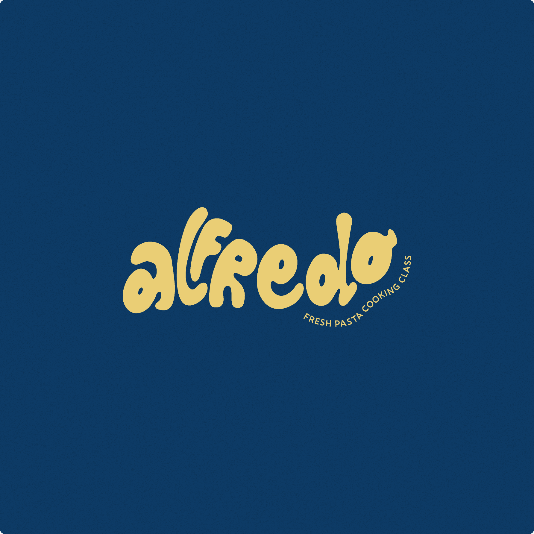
The primary logo expresses Alfredo through handcrafted lettering that feels warm, playful, and rooted in culinary tradition. The custom wordmark conveys movement and tactility, while the curved tagline adds clarity, creating a distinctive identity that works seamlessly across digital and physical touchpoints.
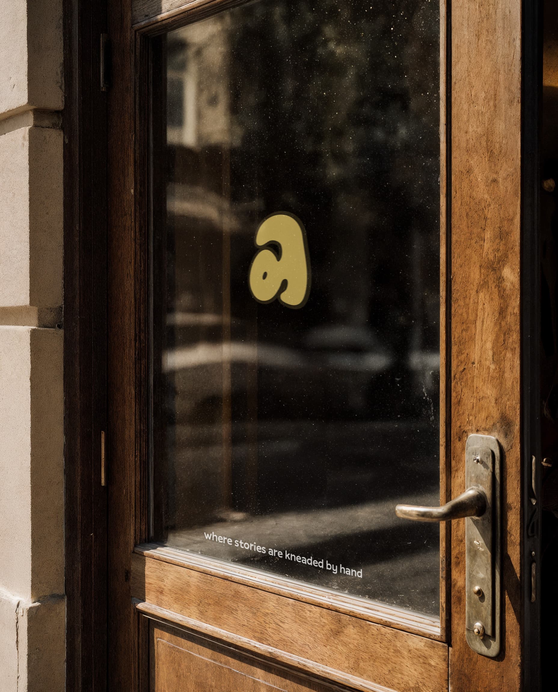
The secondary logo reduces the identity to its purest form, using only the custom lettering for maximum flexibility. The standalone "a" becomes a friendly, expressive emblem, designed to remain recognizable even at the smallest scales.

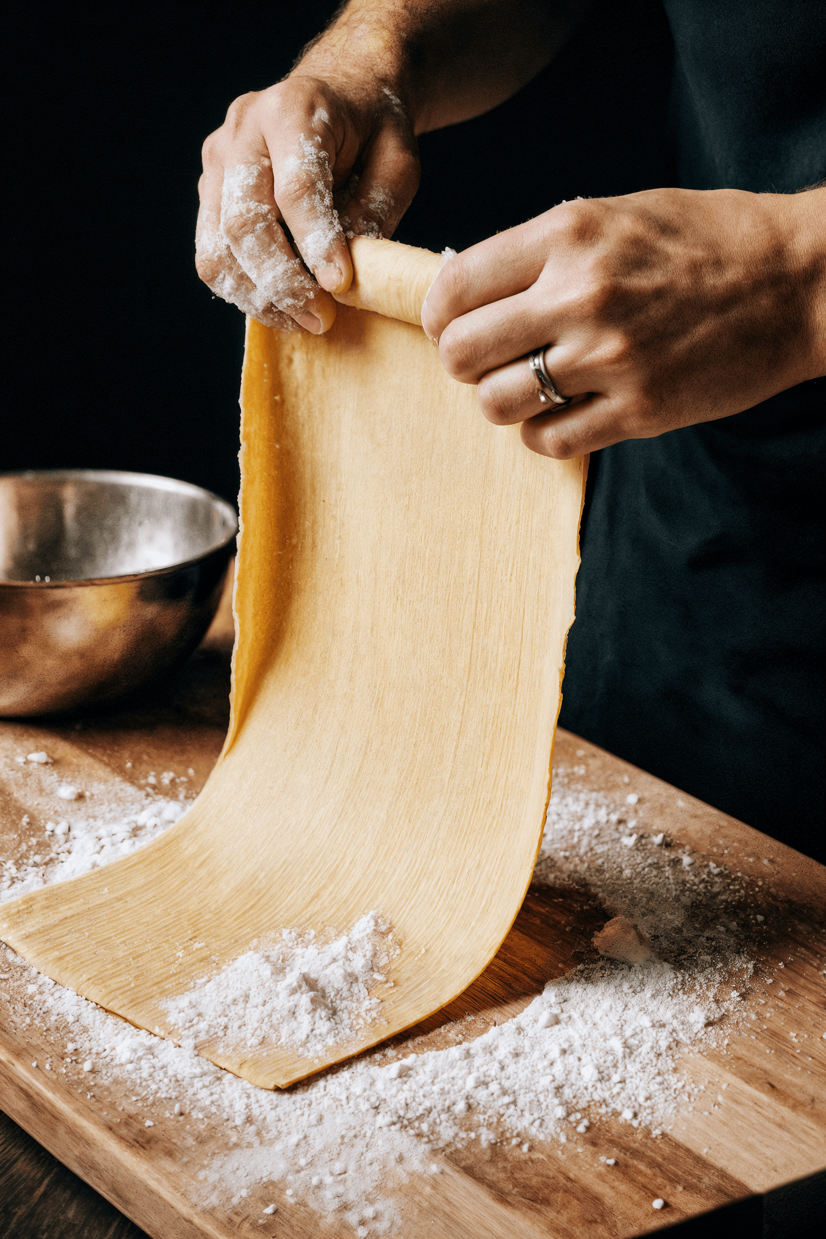
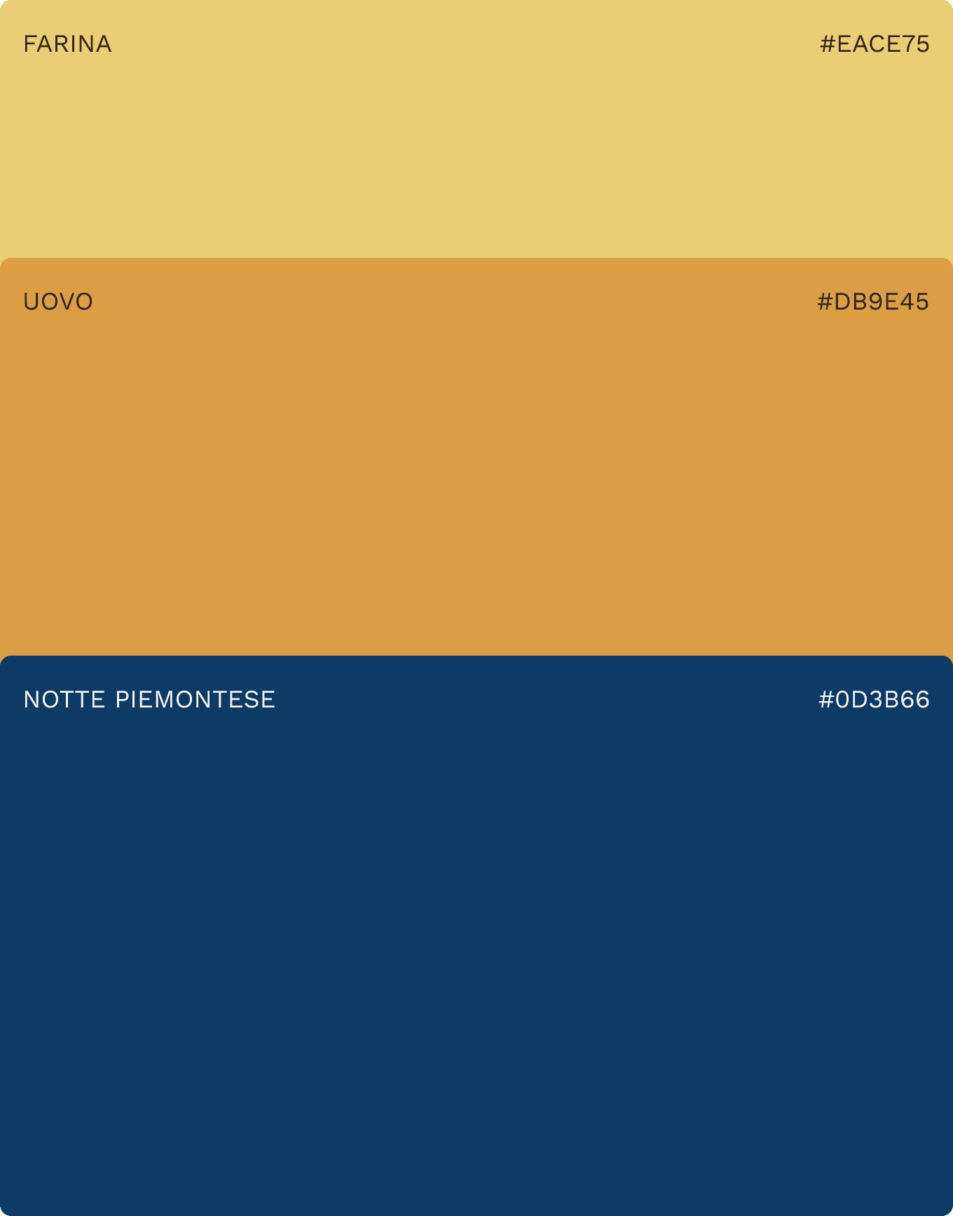
The palette is inspired by the ingredients and atmosphere of pasta making. Warm golden tones and soft creams evoke dough, flour, and tactility, while a deep blue adds balance and depth, grounding the identity in Alfredo's culinary roots.
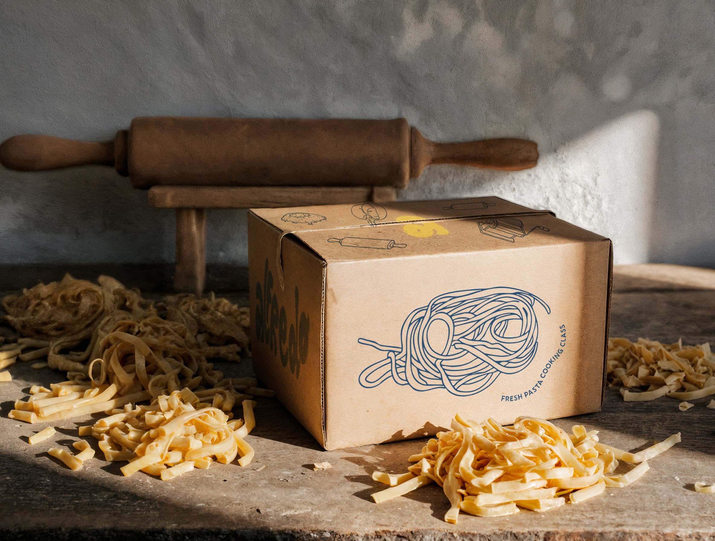
The illustration system features handcrafted drawings inspired by Alfredo's kitchen — ingredients, tools, and iconic pasta shapes. This visual language feels authentic and playful, reinforcing the brand's strong connection to fresh pasta traditions.